Role
Lead Product Designer
UX Researcher
UX Copywriter
Timeline
Late July - Late August
(4 weeks)
Tools
Figma
Figjam
Notion
How Do You Solve “Design for Crisis”?
Climate Change is Terrifying
What Do We Think Our User Wants?
3 Days for Research is a Sprint
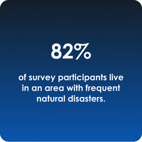
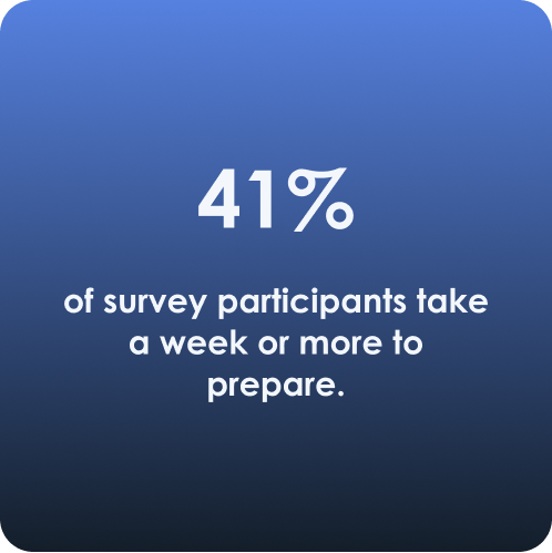
Our focus was understanding how users have been affected by natural disasters and if it changed their behavior and mindsets.
Our methods included a survey to learn about a wide variety of natural disaster experiences, with interviews to learn more details and stories.
What Are Our Competitors Doing?
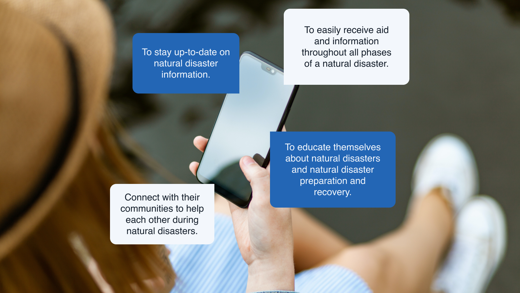
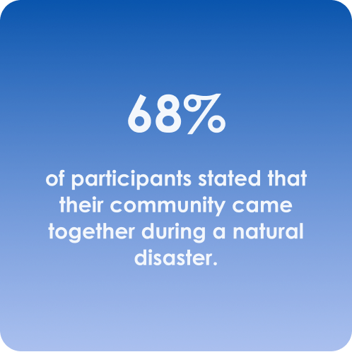
Through user and competitor research, we discovered that users needed resources before, during, and after a natural disaster and that community played a big part in aid and recovery. Through various explorations, the app was able to concentrate on three major aspects to produce a viable MVP.
Feature Prioritization
In our team meeting, we kept thinking of features to add to Co-Weather. Ultimately, feature prioritization was utilized to understand what are the most important features to address our users’ needs.
Meet Nate Bailey & Victoria Hanson
With both our research results and feature prioritization, two personas were created: Victoria Hanson (Natural Disaster Veteran) and Nate Bailey (Natural Disaster Novice). Both personas are located in New Orleans, Louisiana.
All three user flows were based on Nate Bailey who just recently downloaded Co-Weather for an upcoming hurricane.
There’s a First Time For Everything
I was responsible for the onboarding process, profile page, and dashboard. Our user needed to be able to customize their natural disaster preparedness experience including experience level and location.
Account Creation Flow
When the user downloads the app, they set up their account including their preferred name, language, and zipcode to received localized weather updates.
Co-Weather Preview Flow
Once the user sets up their account, they receive a preview of Co-Weather’s features and how they can use them for their natural disaster preparedness.
Emergency Checklist Flow
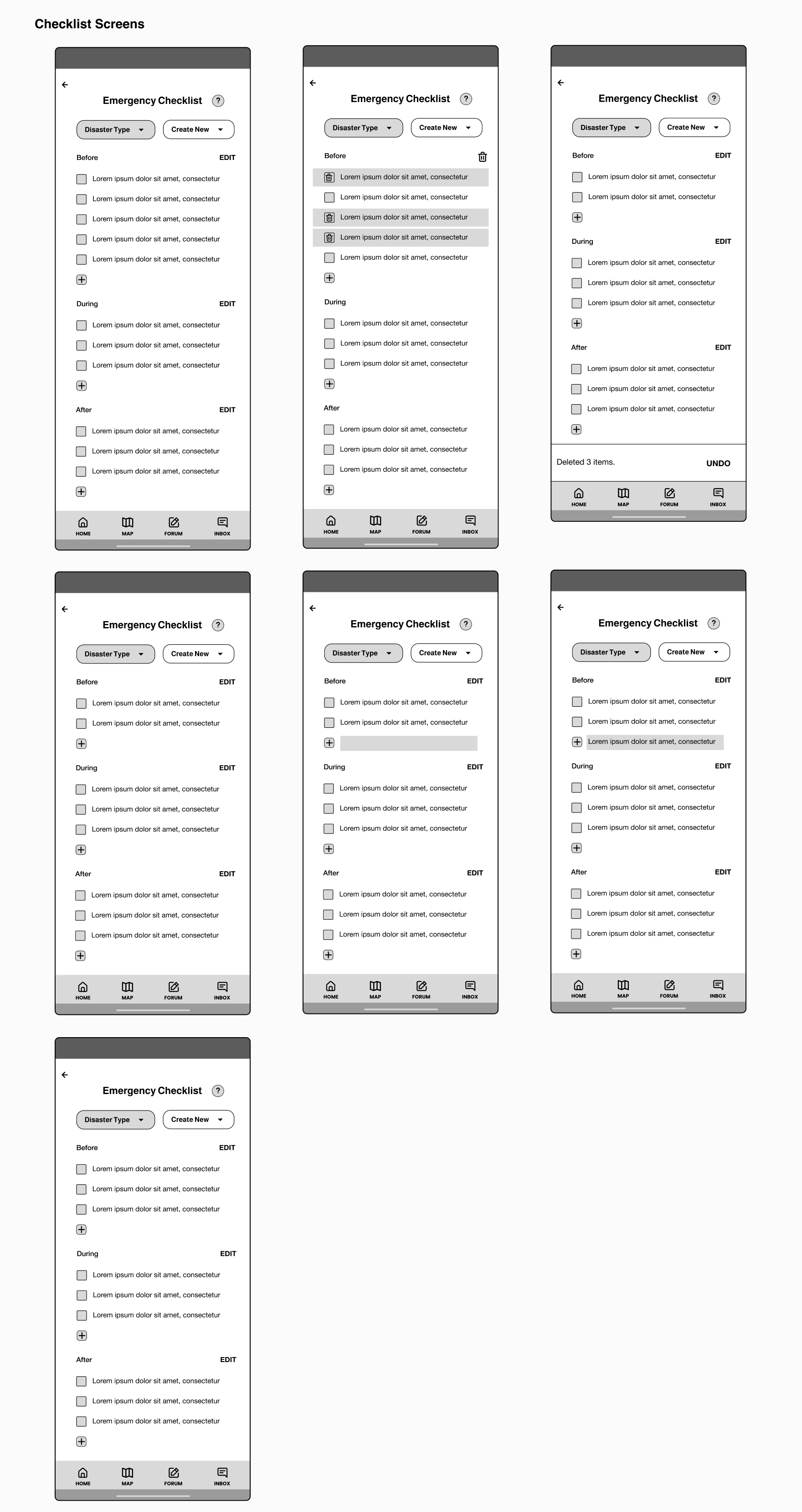
The Emergency Checklist was one of the primary features we wanted for Co-Weather. We also wanted to make sure that users could customize their checklists to fit their needs such as taking care of medication, children, pets, etc.
Account Creation Flow - Part 2
We received feedback that the account creation and preview flows were trivializing the user’s experience, especially in high-stress situations. We needed to get our user from the welcome screen to their dashboard ASAP.
As a result, we re-evaluated the creation flow and focused on the most important details for Co-Weather’s account: name, zipcode, and experience level.
Sometimes Simple is Better
Co-Weather’s branding focused on providing trust and security to our users, along with ensuring accessibility. The logo showcased our goal that communities are one of our greatest strengths.
We kept the branding minimal, utilizing various shades of blues and grays for the color scheme, along with Helvetica as the font.
The Designs That Made Us a Finalist
While there was a lot of features we wanted to include in our final designs, there were a couple that we decided would make Co-Weather’s MVP stand out.
Experience Levels & Location
First, there are two features in the onboarding process that personalize the user’s experience. Co-Weather has experience badges that allows users to select their natural disaster experience and connect with experts with that natural disaster.
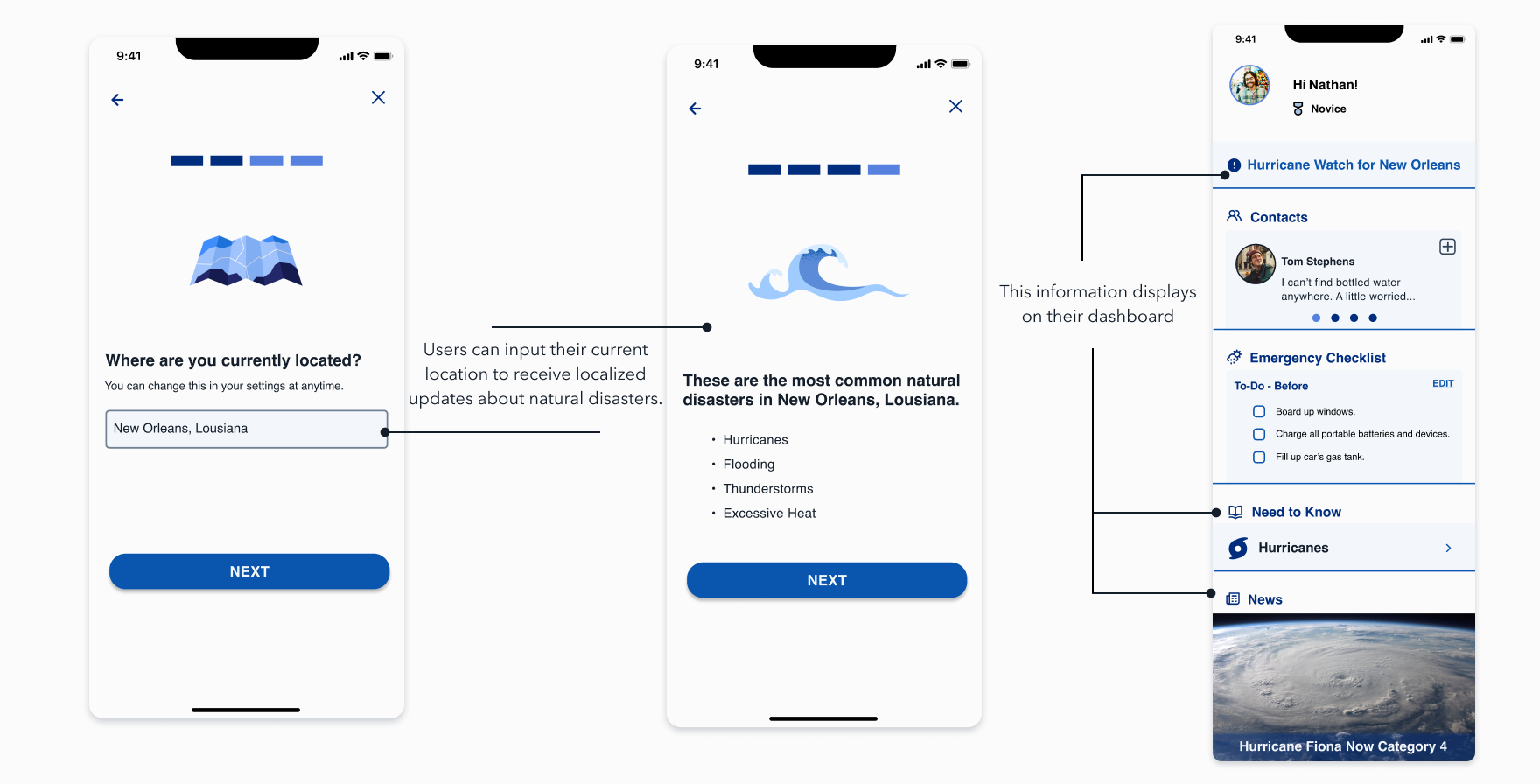
Second, users can input their current location and receive localized updates and advice for their area. If a user moves, they just simply update their zipcode or city and state.
Emergency Checklist
One of the big key features for Co-Weather, was the emergency checklist. Co-Weather comes with templates for different disasters and users can easily customize them to their needs.


